Last week I cleaned up my Twitter account, and documented that process in a post called Twitter Litter. That experience prodded me to take a long hard look at my Welcome Page. I saw quite a few problems like empty space, links that didn’t stand out, a somewhat distanced and impersonal opening paragraph, and a ho-hum title.
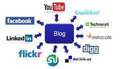
After all, my blog is the center of my social media platform. Which also means that my (and your) welcome page become even more important.
The Title
Before, I had a one word title “Welcome!” Yawn. Then my wife and I (we’re big Mel Brooks fans, as evidenced by his presence on my fav movie lists*), thought about Madeline Kahn’s character Lili Von Shtupp in Blazing Saddles, remember how she responded to a knock on her door? We added an Italian greeting and felt like we had the job done. 🙂
*See how my list of favorite films from the ‘60s, ‘70s and, ‘80s compares to yours.
First Paragraph
Originally, my welcome message was incredibly mediocre. As I read through it, I realized that it wouldn’t inspire anyone to continue. Therefore, I doubled the size of my opening blurb, and added more personal information like some of my core beliefs that work their way into my writing. In a nutshell, I presented the ABC’s of me.

Blog Ecosystem Diagram by I.A. Walsh used under CC License
Empty Space
My blog category list was down at the bottom of the page. It was a slender column with too much blank space. I put them in linear form with five spaces between each one. Now it looks like an abundant amount, mimicking a paragraph.
Link Color
Although the links were now more noticeable and moved toward the top, it may still be difficult for someone to notice them as links rather than underlined text. I customized a brick red color that wasn’t hard on the eyes.

***Put Ragged Souls on your Kindle at Amazon U.S.***
A Personal Photo
I’m not an ego-maniac who needs to see his portrait prominently displayed everywhere. However, as an author’s welcome page, I thought it necessary. After all, you want people to see the front page; feel welcomed, and then are prompted to click, read, and hopefully comment. It’s all about creating a comfy zone. So, I posted my mugshot…um I mean thumbnail portrait and wrapped the text around it.
The Top Menu
We also changed the pages in the top menu bar. Now there’s a published page that lists everything with links to different sites, like Amazon, Smashwords, and Barnes & Noble.
However, the most important change is the addition of a Free Short Stories page. I’ve uploaded one so far but have a few more “waiting in the wings” as they say.
***Notify me when the new Sci-Fi / Horror short story Night Flights is available***
Conclusion
It’s too early to assess the success of these changes as to the impact on blog traffic. But I’m keeping my fingers and eyes crossed. I guess my Facebook Author Page and my blog’s sidebar are next.


I think your welcome page looks great now! Good job!
LikeLike
Thanks O.M.! I appreciate that.
Check out the new free short story page and please comment.
LikeLike
I’ve been to your ‘front page’ before and thought it a little bland. Now that you have rocks there, I’m interested. I’m a rock addict.
I’ve had my site reviewed in the past. There’s a balance I try to reach with regard to the side bars. I want to show visitors what I have, but I don’t want to clutter it because then nothing is seen. The ‘Follow Me’ widget is meant to go at the top because the number one thing you want is followers.
I just shuffled mine a few days ago. I think I might do that every week for a bit. It brings things to the top that might be missed by regular visitors who are reading the post and not looking at the side bar. It’s easy to shuffle the widgets, so the time to do it is 30 seconds.
Your front page looks great now. And you do look like a moody writer. Are we supposed to all look like moody writers? lol
LikeLike
Hi Diane. Thanks for the side bar tips.
Glad you like the new arrangement. I’ve already noticed a better “bounce rate.”
Only children’s authors should look happy. 🙂
LikeLike
That is so not fair. I am happiest when I’m writing. I’m already planning my next photo shoot: some type of fantasy costume and a big smile.
Glad to see you are seeing some results from the facelift.
LikeLike
O.K. I’ll admit it…I’m happy when I write and even happier when I’m in a critique circle.
LikeLike
Love it ! Super Change.
LikeLike
Thankies:-)
LikeLike
This blog was… how do you say it? Relevant!! Finally I’ve
found something which helped me. Cheers!
LikeLike